


![]()
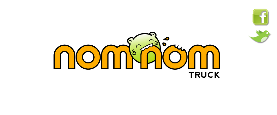
Were trying to decide how our Nom Nom logo should look, and our designer, Allison Torneros, has come up with a few ideas. Weve chosen two that we like the most and now we want to get YOUR thoughts on them! They arent quite final yet, but we want to know which direction to head in. What do you think? Vote now! Feel free to leave comments too! Wed love to hear feedback!


Like the cute creature more in the first but the lettering is better in the second.
i ditto amy!
the 2nd logos font is definitely cuter/more professional looking. i like the color scheme better too.. but i love the critter in the first logo. i love his angle, and the fact that hes in the front of the nom nom